 First impressions are everything. This is especially important with book covers. I know, I know. Don’t judge a book by its cover. Name me a blogger/reviewer/avid reader that doesn’t and I’ll start eating pages from my copy of Twilight. We all do it because aside from the blurb, it’s the first thing that where a reader can get an idea on what the book is about. Put an awesome cover on a book and just sit back and watch bloggers/reviewers drool over it for months before the release. Case and point, Jay Kristoff’s debut novel, Stormdancer, had a little over 1,000 “adds” before the cover was revealed. Afterwards, the number practically doubled in a very short amount of time. There is just something about seeing a badass cover that screams, “Read me!” What’s found in those beautifully crafted covers, well… that’s another story.
Recently, I read an article that questioned the popularity of YA book covers, which I found grossly over generalized YA bloggers. Now, I realize that not all authors have the privilege of giving input on how their covers come out and that by itself sucks. But not all of us are drawn to the same old “I’m a pretty white girl in a gown. Love me!” cover. So that got me thinking a bit. What really makes me say, “AWW YEAH!” or “AWW HELL NAW!” when I look at a cover? I know my standards for novels are pretty high, but I think I’m easy to please when it comes to covers. Unfortunately, we can’t all be winners. Sometimes we lose before we even begin. In my not-so-professional opinion here are my five reasons why I think your cover sucks:
*Please note: The awful covers shown are not real and were created using a few stock photos by Kat.
1. Did my four-year-old whip that up for you?
I really hate to say this, but there are some covers that just make me wonder what the hell went wrong in Photoshop. I mean, come on! If you or the marketing department couldn’t even attempt to make it look nice and smooth or at least non-creepy, why should I spend my hard-earned cash money on it? A cover should look aesthetically pleasing to the eye and have a clear message. It should NOT make me cringe and scream, “Kill it with fire!”
*Image source found here.
2. Haven’t I seen this before?
Copycats. Nobody likes them, but they’re all around us. This is a more recent pet-peeve of mine, but it’s becoming incredibly annoying! This doesn’t necessarily mean the cover looks bad, however, I just find it kinda lazy and cheap when I see a book published by a big publishing house with a cover that is eerily similar to another book. I’m talking about them using the same stock image. Really? Really?! No one could check and make sure the photo hadn’t already been used?
Damn…
Damn…
Damn…!
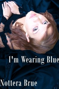
*Image source found here.
3. Cover Fraud!
I don’t know how everyone else feels about this one, but I absolutely hate when a cover has tricked me into believing the book is going to be about one thing, but it’s almost the exact opposite. I know that most of the time the person who is in charge of the cover generally has not read the book. Really, I get it. But can it please be in the ball park? Can you please not feature a kick-ass, warrior girl on the cover, yet she’s nothing but a damsel in distress? Do not give her a sword when all she does his hide and wait for the bad guys to go away. Again, this doesn’t mean it’s a terrible cover design-wise (though it can be), but it is false advertisement. Couldn’t they have simply asked the author, “Hey before we go throwing random stuff on your cover, is it even in the book?” Why waste a reader’s time and money? Do you want an angry review?
Or how about when the cover is completely over-sexualized–when it already had a previous (better) cover–just in hopes to sell more copies to young girls. When a girl is supposed to be depicted as a strong female, why do we have to “sex her up?” Do marketing execs think a girl on the cover of a novel can’t sell unless she is objectified in some way? Can she not hold her own without her sexuality being flaunted in my face?
4. Just another pretty girl in a dress. I hate dresses.
This is a huge one for me and kind of goes hand in hand with reason number three. I’m just so tired of seeing girl after girl (in a dress) on the cover of almost every YA novel (even adult) I read. Yes, they are pretty, but can we get creative? Can the cover symbolize something like a metaphor found in the book? Or perhaps even a scene from the book? It’s not an issue of sales because two of the biggest YA series out right now both feature metaphorical covers.
The article I mentioned earlier accused bloggers of contributing to the issue of spreading unattainable society expectations by loving covers with pretty girls. This is a bit unfair. Readers are not vain, shallow people whose minds can’t wrap around a cover that would make you go, “Hmmm…” Just by looking at both The Hunger Games’ and Twilight’s cover I can remember not having any clue as to why those covers were chosen. It drew me in because I wanted to find out for myself what it stood for. With a pretty girl in a dress, sure it may look really beautiful, but it’s not really saying anything to me about the story other than, “Hey, hey! Look at me! I’m desperate for attention!” As much as I hate Twilight’s story, I can’t deny that I love that cover. Not because it’s the most beautiful, but because it’s interesting. I would love for more publishers to trust a reader’s own discernment instead of relying on her own insecurities to sell books.
5. White Washing
I don’t think there is any other reason that annoys me more than white washing. You know what I mean. Skinny, Caucasian girl on the cover and a Black/Asian/Latino/ect. in the pages. Don’t tell me it’s better marketing. Don’t tell me this is what will sell better. Don’t tell me it doesn’t matter. It’s a slap in the face and it’s down right insulting. A minority finally makes it into a traditionally published, YA novel as the heroine and we can’t even show it on the cover? What’s the issue? You couldn’t find a minority for the photo shoot, so you “cultured” a Caucasian girl?
I know everyone was shocked at the outcry for Amandla Stenberg’s backlash as being cast for Rue in The Hunger Games movie, but color me not surprised. People were appalled to learn their beloved Rue was indeed a Black girl. It’s not hard to have predicted that when the books that actually have people featured on the covers are more than likely Caucasian. There have been a few examples over the years that include two blunders by Bloomsbury: Liar by Justine Larbalestier and Magic Under Glass by Jaclyn Dolamore. In both of those instances, after enough protesting, the original covers that depicted a Caucasian girl was changed to a Black girl. (I’d also like to point out that whenever a Black girl does happen to grace a cover, she is almost always portrayed with a lighter brown complexion and finer hair.) Unfortunately, it doesn’t end there because both Across the Universe by Beth Revis (http://thebooksmugglers.com/2011/01/smugglers’-stash-and-news.html#comment-32720″ target=”_blank”>explained here) and The Immortal Rules by Julie Kagawa (protagonist is of Japanese descent) suffer from this.
So, no. I don’t always like the pretty little covers, with their pretty little girls, in their pretty little dresses, going to their pretty little tea parties. Sometimes my reasons for loving a cover go deeper than that because I am a critical and analytical thinker. So if you wonder why a reader couldn’t grasp the brilliance behind your “unique” cover, they probably have their reasons. The simplest one being:








Pocketful of Books
This is a really awesome, thought-provoking post. I followed the links you gave in the ‘whitewashing’ section and it really is shocking how only 2% of YA books feature non-white people. However, I think it’s difficult to blame the publisher entirely because they have obviously tried and tested this and realised these books don’t sell. That shocks me more…why are people so narrow minded? It’s crazy. I think this is something which really portrays readers in a bad light too.
x
Stephanie Sinclair
@Pocketful of Books:
I think the biggest way to change that perception is to show more minorities on the cover. They can’t sit around and just say, “Oh this book isn’t marketable. Get me a white girl.” This is just another reason why I prefer covers that don’t feature a model at all.
Pocketful of Books
@Stephanie Sinclair: Yeah that’s true- maybe the covers which featured non Caucasian’s were just bad covers in general which was why they didn’t sell as many…not just the model! I think you’re right- if they made more covers like that then people would get used to it and it wouldn’t be an issue…as it is maybe people are just too used to seeing one thing! x
Stephanie Sinclair
@Pocketful of Books:
Yeah, I think it’s odd to assume people will just stop reading simply because the covers don’t feature a white model. They will read it and they will like it! Lol.
Kat Kennedy
@Pocketful of Books:
I don’t know. I think publishers are coping out on this one. If you took a cover with a non caucasian girl and gave it the love and attention that other covers get – I don’t see why it would make a difference. But I think it all begins with a lack of belief that you COULD make a cover with a non Caucasian girl sell books as well. I think it’s rubbish. I think even I could do it.
Pocketful of Books
@Kat Kennedy: You definitely could- you’re photoshop skills above are really impressive! x
Kat Kennedy
@Pocketful of Books:
Hahaha! Wait until you see me REALLY photoshop.
KM
About the whitewashing, I just don’t understand how a publisher can see that the character has a different ethnicity then purposefully put a white model on the cover. In what world does that adequately represent the characters? And I don’t think readers would be less likely to read about a character of a different race. Heck, I’m white and I wrote a book with a an Asian main character. This whitewashing on covers really bugs me. And I think it stems from the same idea of people not wanting to read about anything non-American or -British or whatever. Let’s look outside ourselves, yes?
Stephanie Sinclair
@KM:
I think it boils down to them attempting to make it relatable for consumers. Of course, this excuse causes an even more troubling notion: Are they saying minorities don’t read? Are they saying the average white teen couldn’t possibly relate to someone just because their complexion is darker?
Not marketable? Pfft… Until I start to actually see some work going into covers with minority cover models (ie. more than one cover), then I don’t want to hear that excuse.
Kat Kennedy
I would just like to take a moment for everyone to recognize the brilliance of my emergency photoshop skills. 7 covers in two hours, yeah!
Stephanie Sinclair
@Kat Kennedy:
With each new passing day I am overwhelmed by your blinding brilliance!
Sarah @ Smitten over Books
Well said, well said. I read the aforementioned article from Huffington Post and I almost never got my eyebrows back again in their original, non-creepy position. It’s just so sad when people keep on generalizing book bloggers. What is up with that anyway? I do agree that the Stormdancer cover was pretty amazing! So excited with that one. 🙂
Stephanie Sinclair
@Sarah @ Smitten over Books:
I know, first we’re the mafia now this. Smh.
I can’t wait for Stormdancer too. I’m really excited to see what they are going to do with the US cover.
Phoebe
I’ve been disappointed to realize how wide-spread whitewashing is, and how often it’s not talked about. I’ve encountered a few covers over the last year that were clearly whitewashed or where the protags were as pale as they could have possibly been considered their described races (Daughter of Centaurs, Planesrunner, A Confusion of Princes) that have totally slipped under the radar.
Kat Kennedy
@Phoebe:
I find it extremely depressing.
Phoebe
@Kat Kennedy: It’s so weird! A lot of it seems to be about plausible deniability. Like, oh, brown skin can mean just kind of tan! Elder is described as brown but he’s not black! That sort of thing. But the result is the same: a monoculture of covers.
Kat Kennedy
@Phoebe:
And the same thing gets done in movies. Ie. Jennifer Lawrence as Katnis. Then when they can’t get around casting non caucasians because the movie is about racism – they make the story ALL ABOUT the white people a la The Help!
Sorry, still fuming about that one…
Stephanie Sinclair
@Kat Kennedy:
Yeah, let’s not forget about Avatar!
Stephanie Sinclair
@Phoebe:
You know, the sad thing is I didn’t even notice the white washing done to Across the Universe until after I started looking for examples. That was my first time to seeing the ARC cover and I was very disturbed.
Michelle Cary
I loved this post. You are so right about covers and how some are using them now a day. I once ended up with the same pic used in two different covers by two different publishers. The covers were different enough, but anyone could tell the pics were the same. Never knew if I should put them next to each other or far apart on my website. Got rid of one of the publishers, so I don’t have that problem anymore, but still…
Stephanie Sinclair
@Michelle Cary:
Thanks, Michelle. I can only imagine how an author must feel when that happens!
Kate C.
Okay, I know I say this a LOT, but there is something to be said about being able to design/create your own cover as an indie. Kenya Wright’s cover for Burning Bush is AWESOME. So is Betrayal, by Mayandree Michel. (Not sure what her ethnicity is exactly, as I haven’t read it yet, but the girl on the cover is NOT white). I have a story in mind for the Five Tribes series (standalone) and the two main characters are twins who are also black. The cover I picture has the two of them on it. I love being able to pick my covers.
BTW-I know you weren’t shocked, but frankly, I was SHOCKED by what people were saying about Rue. OMG. My eyes have been opened and I am a lot more sad today. I thought prejudice like that was something only old people held onto, but the majority of the people in those twitter accounts were so YOUNG! I was utterly naive. And I’m kind of ashamed of myself for not realizing that. Sometimes I feel like I must live in a bubble or something.
Kat Kennedy
@Kate C.:
Okay, so am I designing you a geisha girl or half naked girl for your cover?
Kate C.
@Kat Kennedy: Well, I’ve already seen half naked girl in the indie book community. (I actually thought you had decided to post all indie covers for a second there, hahaha!)
So, I’ll take the geisha. But she must (and I cannot stress this enough) have JAZZHANDS.
Kat Kennedy
@Kate C.: Comment
Fine! I’ll photoshop the jazz hands in.
Kate C.
@Stephanie: OMG, I was sooooo pissed about Avatar. Especially since Shamalayan(SP) is not white, either. Like, WTH???
Lavi
Great post! Loved the emergency Photoshop and I was quite shocked to see the books with identical covers. Maybe I am completely naive, but I was convinced that books that are published have their covers custom made. Like unique models, unique designs, appropriate for the content and all. With actual input from the writer, not just “Yeah, sure, I looove this pic on deviantart, pimp it up a bit and we’re done.” I also agree with the pretty girls on the covers. They are a huge turn off because, usually, the really good books, the relevant ones have true art on them, not just the same cliched babe. I suppose it depends on the nature of the key audience…
Bookphile
#3 is one that irks not only readers, but authors. I don’t know if you’ve ever read any of the Dresden Files by Jim Butcher, but the covers always feature the main character, Harry Dresden, in a long duster and fedora, carrying a staff. Yet the character never, ever wears a hat. In fact, Jim Butcher was so irritated with this particular aspect of the cover designs that he actually had a scene in one book in which Harry puts on a hat, thinks about how stupid he looks in it, and takes it off.
Just goes to show you that authors usually don’t have much control over their covers.
Stephanie Sinclair
@Bookphile:
Yeah, I wish they at least had some input when it comes to cover designs for their own book. I think they’d probably come out way better…
Soliloqueous Rex
Great post ladies.
Covers really do come down to marketability and the demographic they are aimed at. I consider the evolution of the covers to the Fever series: they got progressively less sexual and more mystical, which was what the book was about (sans the erotica).
It is the sad reality of the world that whitewashing must occur. It impinges on aeons of cultural conditioning in which anything but white is not right on the cover of our publications or in our media (Casper Van Dein playing a Phillipino???) Rather sad.
To reiterate, another great post and Kat, marvellous photoshop skills. You have amazing talent.
Keep up the great work ladies.
Ashley
First, I have to say I love the examples you created in Photoshop (esp. the geisha one)! So funny! Second, I agree wholeheartedly with everything you said. I find it frustrating that the only stories featuring people of colour on the cover to get widespread praise are the ones where race is an issue easily packaged for white people to understand. Then they win awards and perpetuate the idea that a story with a person of colour on the cover can only be an “issues” story about racial inequality. Then if a YA book is about a regular teen, they have to default the people on the cover to white or else people will think it’s about race because the only covers with people of colour on them are about race. The cycle repeats. Sigh.
Stephanie Sinclair
@Ashley:
Yes! That constantly bugs me. Other races can kick paranormal ass too. Let us have at it!
Gellie
YES! THE GIRL IN THE DRESS FAD. You would think they were making a fashion catalogue rather than a book cover!
Great post!
Stephanie Sinclair
@Gellie:
You know, some of the dresses on the covers are from runway shows. One in particular was Everneath by Brodi Ashton. It’s a beautiful cover, don’t get me wrong. And the dress is pretty hot too, but I think the MC wears a dress for maybe only one scene. -_-
Reut
Awesome post; all your reasons are pretty spot-on. White washing is just terrible, but I think it’ll be dying out soon. (You can check out The Chaos by Nalo Hopkinson’s cover as evidence of that, the girl is lighter but doesn’t have fine hair like you’ve mentioned.)
Stephanie Sinclair
@Reut:
I hope so. It’s a very disgusting practice.
Lexie B.
100% agreed with these. I’ll admit to being particularly picky in the cover area, because I spent about two years making covers for my writing and my friends’ on a writing site, and when I see a cover and realize *I* could’ve made that in about two minutes, well, it’s a wee bit disappointing.
But the girls-in-pretty-dresses and white-washing are by far the worst trends. I hate the girls-in-pretty-dresses trend because they say nothing whatsoever about the book, and I feel as if they objectify women; a girl couldn’t possibly be doing anything relevant to the book, oh no. She must simply stand there and look pretty.
And then the white-washing . . . it’s disgusting, honestly. We like to pretend we have no bias, no discrimination, but that’s bullshit. Putting a white face on a character explicitly described as black, Asian, multiracial, etc. is plain wrong. If The Immortal Rules really does become a movie and Allie’s actor is Caucasian, I will barf.
Stephanie Sinclair
@Lexie B.:
Has The Immortal Rules been optioned for a film?
Lexie B.
@Stephanie Sinclair: Yes.
rameau
About Rue. I read the book, of course I was expecting to see a cute little black girl cast in the part. Being upset about not whitewashing her makes me weep for reading comprehension skill of the English speaking world. As for Jennifer Lawrence, hair dye and spray tan have been invented. I wasn’t surprised (based on the promo pics) they only used one of them.
All these stock images and pretty dresses make me appreciate these even more
http://www.goodreads.com/book/show/3440721-stalinin-lehm-t
http://www.goodreads.com/book/show/4312567-baby-jane
http://www.goodreads.com/book/show/10350882-he-died-with-his-eyes-open
http://www.goodreads.com/book/show/7863274-graffiti-moon
http://www.goodreads.com/book/show/11926886-hirtetty-mies
Jenny
Those covers are brilliant. They’re actually better than a lot of self-pub covers I’ve seen. And the names on them are hilarious.
Nevertheless you make some really good points here. Especially #5. I can’t believe there are still people willing to bend under booksellers who say they can’t even GIVE away books with black people on the cover. What a horrible thought too though that there are young people out there who won’t read books about people of differing races! I love learning about new cultures so books like Cinder, with its heavy Chinese setting & background, are a treat to read. But perhaps I’m one of only a handful that actually likes to LEARN while I read & not just be entertained. I don’t know. Whitewashing makes me mad.
alybabybooks
I really loved this post. I’m really curious though about your post on Across The Universe. The link isn’t working and i would love to read it.