It is a super exciting day here on Cuddlebuggery because we’re revealing the cover for Nevernight, the first book in Jay Kristoff’s new fantasy trilogy (to be released August 9th, mark your calendars).
I, personally, am extremely excited about this reveal because guess what? I did the typography for it.
(“WHAAAAAAAAAAAAAAAAAAAAAAAAAAAAAAAAAAAAAAAAAAAAAAAAAAAAAAAAAAAAAAT” – my entire brain since October)
Because I’m a nice person when it suits me, I’ll show you the cover first and then for anyone who wants to stick around and is passingly curious how I set about this project, I’ll ramble until the cows come home about the process. Sound good? Good.
First, a note from Jay:
I’m a huge typography nerd, and I’d LURRRRVED the work I’d seen Meg do on her Super Awesome Cover Redesign Project. Convincing my editor to let a complete stranger handle the typography, given how awesome Jason’s illustration was . . . well, that took some convincing. But I throw an awesome author tantrum when I have to – I lay on the ground and flail and everything.
When Meg sent through the finished typography laid out on the cover illo, I actually squeed. Squeeeeeeeed like a small orphan boy when given a double helping of gruel at the orphanage xmas dinner. Squeeeeeeeeeeed like Squee McSqueege, winner of last year’s inaugural World Squeeing Championships.
I mean look at it! It’s amazing!
SQUUEEEEEEEEEEEEEEEE
Are you excited? I’m excited. I’m so excited I’m shaking like a kitten that just scrambled out of the bath they accidentally fell in and doesn’t know what the fuck is going on.
HERE WE GO
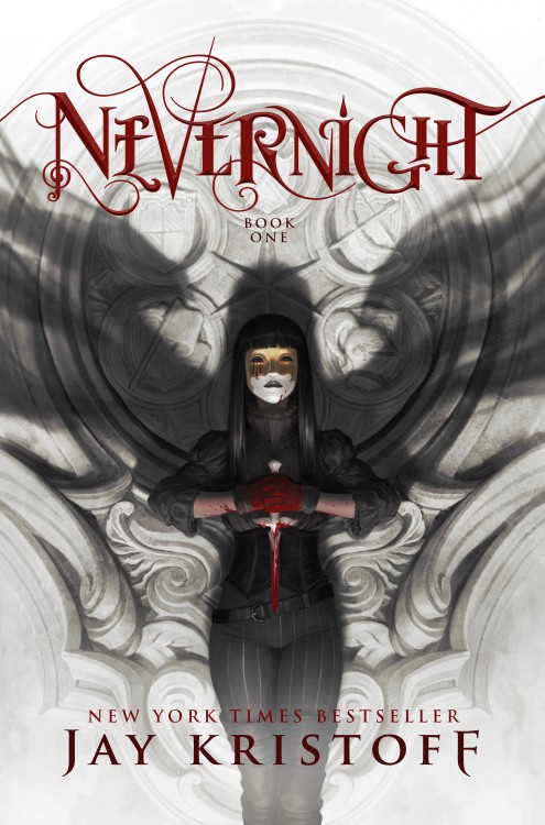
I feel kind of weird losing my shit over how awesome it is but fuck it, it came out awesomely and working with these incredibly talented people on what is sure to be an incredible book is hands down the coolest career opportunity that has ever come my way. Look at Jason’s amazing illustration, how next level epic murdery is that? I love it.
If this book wasn’t already on your radar you should probably fix that. I mean, check out this synopsis:
The first in an epic new fantasy series from the New York Times and international bestselling author.
In a land where three suns almost never set, a fledgling killer joins a school of assassins, seeking vengeance against the powers who destroyed her family.
Daughter of an executed traitor, Mia Corvere is barely able to escape her father’s failed rebellion with her life. Alone and friendless, she hides in a city built from the bones of a dead god, hunted by the Senate and her father’s former comrades. But her gift for speaking with the shadows leads her to the door of a retired killer, and a future she never imagined.
Now, a sixteen year old Mia is apprenticed to the deadliest flock of assassins in the entire Republic — the Red Church. Treachery and trials await her with the Church’s halls, and to fail is to die. But if she survives to initiation, Mia will be inducted among the chosen of the Lady of Blessed Murder, and one step closer to the only thing she desires.
Revenge.
Let’s recap, shall we? School of assassins. City built from the bones of a dead god. Hunted girl with shadow powers. LADY OF BLESSED MURDER. If that’s not enough for you, Mister Kristoff himself has described the series as “Lies of Locke Lamora meets Harry Potter” which sounds pretty fucking neat to me and I haven’t even read Lies yet. I don’t know about you but I’m all over this, especially when you consider how fantastic (and horribly heartbreaking and awful) The Lotus War trilogy and Illuminae are.
If you’re a pre-ordering sort of person, I highly recommend locking down a copy at one of the following:
Amazon | Barnes & Noble | The Book Depository | Indiebound | Powell’s
[about-author]
SO.
How did I get involved with this project? I honestly don’t have a good answer for that on a grand, cosmic scale but in the physical world we inhabit, I got a DM from Jay saying this might be a total long shot and not work out at all but would I be interested in designing the cover typography for his upcoming book. Cue me (literally) falling on the floor (my husband thought I’d had a stroke because of the aforementioned falling and when he asked if I was okay, I just kept making these whimpery keening noises and waving my phone at him).
Anyway, fast forward through some back and forth and me being an undignified level of excited and grateful, I received the illustration and my art direction: “make it awesome (and legible), I have no preconceived notions.” For those following along, this is the absolute best kind of art direction you can receive and it almost never happens. It is also extremely hard on one’s nervous system because omg am I going to live up to that? I’m supposed to do work worthy of a Jason Chan illustration? What am I even doing here how did this happen?
I generally start my typography projects one of two ways, I either hand letter what I’m going for and then pull it into Adobe Illustrator to trace it or I pick an existing font and customize the ever-loving shit out of it. For Nevernight, I did two initial concepts using both processes.
Concept One:
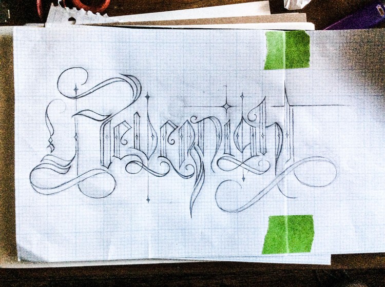
(excuse the quality, contrast boosted for tracing purposes)
For this concept, I was going for a vaguely medieval italian blackletter sort of style (fun type nerd fact, italian blackletter is called rotunda and can be differentiated from northern, germanic blacklettering because it’s rounder) (this is the kind of inane super specific and highly useless information my brain is filled with). I added some flourishes to give a kind of smokey, movement sort of vibe to tie in the whole shadow theme of the book and illustration, and a lot of pointy bits so it would look like it could slit your throat.
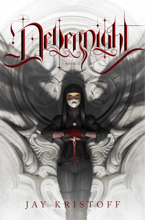
Concept 2:
Sometimes when I’m eyeballs deep in letters, I’ll start looking at typefaces like ‘man it would be really cool if I took the leg off of this letter and stuck it on here and then kind of wiggled this bit around and redrew my own version of the top half of this one…’ and then the typographer’s equivalent of Frankenstein’s monster is born. That process fairly accurately describes what happened with concept number two. I started with one of my favorite fancy serif fonts and basically hacked it to pieces and put it back together the way I wanted.
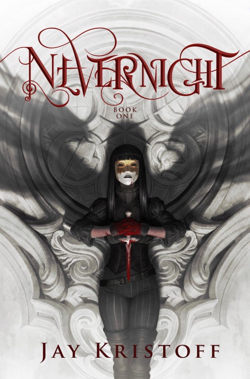
Obvs concept two was the winner.
The feedback after this round was that it needed to be more legible. The tricky part with that is that after staring at it for more hours than I feel like sharing, I knew it inside and out and was hopelessly biased. After a quick poll (aka me shoving it in my husband and parent’s faces howling WHAT’S WRONG WITH THIS because dramatics are my jam), I concluded that the first E, ER and the I were the primary trouble zones. I played around with those and adjusted the letter spacing and tada! Round two.
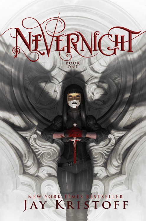

Normally on a project like this I’d like to do more variations, but working with heavily customized type vs a font means revisions are kind of a time consuming operation so you have to make your revision time count.
Jay wanted to go with version two and after playing around with his name to increase the symmetry because it turns out we’re both hyper focused detail nerds when it comes to our typography, the final cover for Nevernight was born.

One more time because THIS WHOLE EXPERIENCE HAS BEEN THE COOLEST AND I WILL NEVER BE OVER IT.
Fun fact, I also did a lot of custom typography for the interior of the book but you have to wait until it comes out to see that.
I’ve mentioned before that the entire reason I got into graphic design in the first place is for the theoretical chance that I could design book covers in the far distant future and having gotten the opportunity to work on this book with this author is so beyond what I thought I could achieve at this point in my career. I’m very open about my general state of emotional overwhelmedness but even I am embarrassed to tell you how often I cried during this whole process. Thank you so much Jay for reaching out to me, I honestly can’t express the full magnitude of my gratitude. Thank you Thomas Dunne/St. Martin’s for taking a chance on this, I can only imagine what the conversation looked like. And thank you to everyone who has been so amazingly cool and enthusiastic about and promoted the Super Awesome Cover Redesign project, you guys are the best and group hugs all around.
Alright, mush over, on to the giveaway.
Giveaway
I am so excited about this book (and no small amount by the idea of my typography invading your homes) that I’m giving away a pre-order of Nevernight.
- To enter, please fill out the Raffelcopter form below.
- You must be 13+ years to enter
- The giveaway is open to any country The Book Depository ships to (not sure? check this list)
- Please enter your email address in the Rafflecopter form and not the comments.


Judith
IT IS SO BEAUTIFUL STUNNING GORGEOUS I AM SO SO SO PROUD OF YOU YAYYYYYYY <3333333
Meg Morley
AHHHHHHHHH THANK YOU THANK YOU THANK YOOOUUUUU <333333333333333
Kristie
Holy beautiful batman babies!! ????????????????
Meg Morley
this is my favorite thing anyone’s said about it 😀
stacee @adventures of a book junkie
HOLY CRAP IT’S SO GORGEOUS!! CONGRATS THIS IS AMAZING!!
Meg Morley
THANK YOOOOUUUUU!!!!!!
Jane
THIS IS AMAZING!!!!! Congrats Meg!
Meg Morley
EEEEEEEEEEE THANK YOOOUUUUU!!! <333
Sara @ A Gingerly Review
AMAZEBALLS!!!
(p.s. I cannot see the rafflecopter. BOO)
Angela
It’s not loading for me either
Meg Morley
apologies guys! I somehow broke it but it’s fixed now
Bekka
This is SO COOL and AMAZING AND I AM SO HAPPY FOR YOU. ALSO THE COVER IS STUNNING.
IM SORRY FOR YELLING BUT I THINK THE SITUATION PROBABLY CALLS FOR ALL CAPS.
Meg Morley
FAIR ENOUGH I DON’T KNOW IF I’LL EVER COME OUT OF ALL CAPS? WHATEVER. ANYWAY. THANK YOU!!!!! <33333
Laura Thomas
Superb! If I spotted this in a store, I’d buy it without even reading the blurb.
Meg Morley
That is the most awesome thing to say!! Thank you! (but omg that blurb though)
Laura Thomas
I know. It’s all a win win!!
Sana // artsy musings of a bibliophile
‘so it would look like it could slit your throat.’ I MEAAAAN, TYPOGRAPHY GOALS.
I LOVE THIS SO MUCH. IT’S SO STUNNING, THE TYPOGRAPHY IS BLOODY GORGEOUS, THE COLOR PALETTE IS MY FAVE AND I’M SUPER EXCITED FOR THE CUSTOM TYPOGRAPHY YOU DID INSIDE THE BOOK. YOU’RE SO TALENTED AND I LOVED READING ABOUT THE PROCESS AND THE CRYING AND IT TURNED OUT PERFECT. I WAS ALREADY SO EXCITED FOR THE BOOK ITSELF SO NOW THE EXCITEMENT IS OFF THE CHARTS.
Meg Morley
AHHHHHHHHH THANK YOU THANK YOU THANK YOU I’M SO GLAD YOU APPRECIATE THE BLOODY MURDER VIBES BUT OF COURSE YOU DO BECAUSE YOU ARE AN EXCELLENT PERSON WHO LIKES EXCELLENT THINGS AND OMG HOW HOW AMAZING DOES THIS BOOK SOUND????? I CANNOT WAIT
La La in the Library
WOW!
Meg Morley
<333
Chasia Lloyd
This is so gorgeous!!!! Can’t wait to see the interior!
Meg Morley
I can’t wait for you guys to see the interior!!!
Lucia @Reading Is My Breathing
OMG, this is such a beautiful cover and typography! You did amazing job.
This books has been on my radar for some time, but now I am even more excited to read it 🙂 Is it August, yet?
Meg Morley
We need time machines so bad. (THANK YOU!!!!)
Bonnie @ A Backwards Story
That looks AMAZING!!! Congratulations on an amazing job very well done! And it stands up really well against Jason Chan’s design! It looks brilliant!
I also LOVED seeing a behind-the-scenes look at what went into building the typography. I love all the elements of cover AND typography AND interior design (Maybe a little on that later on closer to or after release? ^.~)
Fantastic job!!
Meg Morley
THANK YOU!!!!! omg isn’t that illustration brilliant? I’m a Jason Chan fan so this was like whuuuuuuuut.
I’m glad you liked the post! I can never tell if people are going to actually enjoy me rambling about design (I can ramble like a champion) so it makes me happy that people got something out of it 😀 (maaaaaaaaaybe, I honestly don’t know if I’m allowed to do that kind of thing so it may have to be a post release kind of deal)
NEVERNIGHT cover reveal! | Jay Kristoff - Literary Giant
[…] Cuddlebuggery – Cover reveal and special post from our typographer, the awesome Meg Morely from Cuddlebuggery. […]
Shelly
OMFG IM SO AMAZED WHAT OMFG MEG WHAT YOU BEAUTY OMFG ????????
Meg Morley
AHHHHHHHH THANK YOOOUUUUU <3333333
Bee @ Quite the Novel Idea
IT’S TOO GORGEOUS OMG.
Meg Morley
<3333
Amanda
Meg that is so badass!! And OMG so obviously I want the book! So awesome!
Meg Morley
IT SOUNDS SO GOOD DOESN’T IT??? I cannot wait. THANK YOU!!!!
Anya @ On Starships and Dragonwings
1. Gorgeous 2. You haven’t read Locke Lamora??????? Goooooooo doooooooo! Seriously, it’s you perfect book!
Meg Morley
1. <33333 2. I KNOW I AM SUCH A FAILURE (although it is on my I WILL READ THIS BOOK THIS YEAR list, so, points for that?
Anya @ On Starships and Dragonwings
Never a failure! Just saving the best for this year 😉 I don’t know if you dig audiobooks, but the audiobook is fantastic!
Deyse
OH MY GOD THIS IS SO GORGEOUS! I CAN’T EVEN IMAGINE THE FEELINGS OF HAVING BEING A PART OF THIS, BUT OH MY GOD THERE IS GONNA BE A BOOK OUT THERE WITH YOUR TYPOGRAPHY ON IT!!!! ON ACTUAL PRINT!!! ON STORES!!! ALL OVER THE WORLD!!! SO HAPPY FOR YOU <3
Meg Morley
THANK YOU THANK YOU THANK YOU!!!! I AM VERY FREAKEDOUTEXCITEDOVERWHELMED <33333
Ashley S.
Congratulations, Meg! I have never virtually interacted with you before, but I love your reviews and I follow you on Twitter, and I recently binged on the first two seasons of The 100 based entirely on your flailing. I love it. Anyway, I just wanted to poke my head out of my online stalker shell to tell you that I think this typography is AMAZING and I am so excited that you had such an awesome opportunity. Here’s hoping many more cool opportunities come your way!
Meg Morley
Thank you!!!! (omg i totally feel the online stalker shell, have been there so many times, I’m super glad you poked your head out though it’s awesome to hear from you) (also OMGGGGG YOU WATCHED THE 100!! DID YOU LIKE IT? TELL ME EVERYTHING) (seriously, that show is ruining my life and I will talk about it for actual years)
Kate Copeseeley
I don’t think I need to tell you how awesome this looks! But I’m so excited for you!!! And the book sounds so great. I guess I should finish the other series now, huh? lol (I’ve been so scared…)
Ellis
I CAN’T BELIEVE YOU’RE ALSO INVOLVED IN DOING THE INTERIOR (oo-er) AND I HAVE TO WAIT ANOTHER SEVEN TO EIGHT MONTHS TO SEE IT MEGARA I AM SO PROUD AND IN AWE AND HOW DOES YOUR BRAIN EVEN WORK HOW DO YOU GET FROM AN IDEA TO THIS I KNOW YOU JUST TOLD ME BUT IT’S STILL MAGIC
MAGIC I SAY
pouring one (or a few) out for the entire morley family and the trials they had to go through during these trying times
So besides this being the most stunning creation in the universe of title creations and the best and most informative backstory I’ve come across, this has also proven to be the most productive case of sliding into someone’s dms ever documented. Well done.
Now go watch Shadowhunters because Matthew Daddario’s face more or less rivals your font. (No it doesn’t. Your title design totally wins. But it’s CLOSE.)
Maraia
I seriously can’t believe how awesome this is! As if we all needed another reason to be excited for Nevernight. I’m so excited for you, and I hope this leads to more book cover design opportunities! I also really enjoyed reading about how you designed it, because I had no idea how that process worked and always wondered.
Stephanie @ Reading is Better With Cupcakes
I loved seeing the process of how it came to be! Thank you for sharing!
rogier (@rocapri)
Meg it’s gorgeous. It’s gorgeous. congrats
Danielle
This is AMAZING – I love that you shared all of the super-nerdy details with us! And I loved looking for all the changes you made between drafts. This is gorgeous!
Brittney
I work for an Indie bookstore and I immediately emailed the cover image to all of my bookseller bros. Covers are super important to us (even the best book ever can be impossible to handsell if it has a bad cover), and this cover is amazing.
The first thing most of my coworkers commented on was your typography, which we all love!
JoLee
The cover looks incredible! Stunning! Congratulations, and I love reading about your process.
Bec @ Readers in Wonderland
HOLY SHIT IT’S AMAZING!! That typography is gorgeous! You’ve done a brilliant job
Pili @ In Love With Handmade
HOLY SHITZU MEG!! When a few minutes ago I saw the cover at The Midnight Garden I was freaking out because it’s awesome and creepy and I LOOOOVED the typography for the title because so awesome and I was wondering if the letters will be embossed?? AND YOU MADE THAT AWESOME!!!
I’ve loved reading about the process and see how it started and how lil things change here and there until we get the very awesome finished product!!
Amber Hsu
WOW THE COVER IS GORGEOUS THE TYPOGRAPHY SO PERFECT. I LOVE LOVE LOVED YOUR SUPER AWESOME COVER REDESIGN PROJECT AND THIS IS JUST WOAH. CONGRATULATIONS!!
Sarah J.
This is so cool! Congrats on being apart of creating an amazing cover. I LOVE IT!
Paula Stokes
Whoa! You are incredibly talented. This is brilliant and I can see a lot more work coming your way after this gets around. Congrats 🙂
Zeee @ I Heart Romance
THIS IS GORGEOUS! I think you did an amazing job with the typography Meg! Can’t wait to see more of the custom made stuff inside the book!
Lynn K.
Congratulations Meg!
NGL the first thing I loved about the cover was the typography when my friend showed it to me. <3
Andrea @ The Overstuffed Bookcase
OMGOMGOMGOMGOMGOMGGOMGOMGOMGOMGOMGOMGOMGOMGOMGOMG
YEAH.
Kira Brighton
Congrats, Meg, this is awesome!!! 😀
Jess Haines
That is beautiful and amazing! Congratulations! Not only is that cover gorgeous, the story sounds amazing. You had me at Locke Lamora, lol.
<3,
-J
Nemo @ Young Adult At Heart
It’s so totally awesome that you’re a step closer to achieving your dream and this has been such a wonderful opportunity for you. I’m so pleased for you, and the cover surely is gorgeous and I’m sure the inside is too. Well done, and thank you for sharing the story because I liked seeing your progress. I hope you design many more covers in your future.
Carina Olsen
Sigh, this post is the best. <3 You are AWESOME Meg 😀 I love that you got to do this. Yessss. You are so lucky 😀 Your typo-thingy looks stunning. I love it so much. And this cover is simply the bestest. So pretty. So epic. I cannot wait to read this book. Been waiting forever. <3 I adore Jay. So much. Nevernight is going to be THE BEST BOOK 😀 I'm so excited. <3 Love that you got to share this cover first 🙂 And love all the different versions of the title you made. Yay. Final one is so stunning 🙂 And ahh, thank you so much for pre-order giveaway. <3 Crossing my fingers 🙂
Cait @ Paper Fury
OKAY BUT HOLY WOW, YOU ARE SO TALENTED!! (And congrats on getting an opportunity like this afjdkalfsd that is so so awesome. YOU’RE FAMOUS.) XDXD I cannot wait for this book, also. ;D
Paul
Omg this looks amahhhzing. I LOVE your typography and the illustration of the girl looks AMAZING and the synopsis looks PERFECT as well. I NEED to get this book right now omg. CONGRATULATIONS!! (Also give me more information about this Super Awesome Cover Redesign Project or I will kidnap your cats and hold them hostage mwaha)
Waiting on Wednesday: Nevernight by Jay Kristoff - Super Space Chick Super Space Chick
[…] and spooky cover was released last week and what’s even more exciting is that Meg from Cuddlebuggery did the typography for the book! How awesome is that?! I am honestly just obsessed with this […]
Beth W
The fact that you actually lived the dream of many graphic designers I know (and were able to turn your passion into a paid gig- which is my dream, too) makes me kinda hate you a little. But then, you’re so damned talented that’s difficult to maintain. I LOVE ALL THE VERSIONS. And I’m dog-earing you as the cover designer for my future published novel. As soon as I finish writing it.
Waiting on Wednesday (73): Nevernight by Jay Kristoff - The Overstuffed Test Site
[…] synopsis. And LOOK AT THAT COVER. JUST LOOK AT IT. And you know who did the typography? Meg from Cuddlebuggery. She’s an awesome blogger and obviously super talented with typography, as well. I just […]