Here’s a thing you may or may not know about me, in my not-shouting-at-hapless-bystanders-on-the-internet life, I’m a graphic designer. Fun fact, my love of books is indirectly responsible for me becoming a graphic designer in the first place. Back when I was a freshman in college, idly wandering the halls, taking random classes and trying to figure out how I could turn decent but not anything resembling remarkable drawing skills into a career that would pay me actual money, I more or less randomly ended up in an intro to graphic design class. One of the first guest speakers to come in was a book cover designer and I was immediately sold. Being a cover designer was my dream job and there was nothing I wanted to do more than that. Naturally, I spent the next six years doing nothing remotely like that (I mean, okay, remotely in the sense it was graphic design but not that in every other way).
For awhile now I’ve been thinking and occasionally talking about how I would design covers and I should just do my own for fun (and then never actually doing anything because inertia is a problem for me. BUT NO LONGER. I’ve started working on some of my own versions of various covers and I’ve decided to share them with you because hording them on my computer and never letting them see the sun seems unproductive.
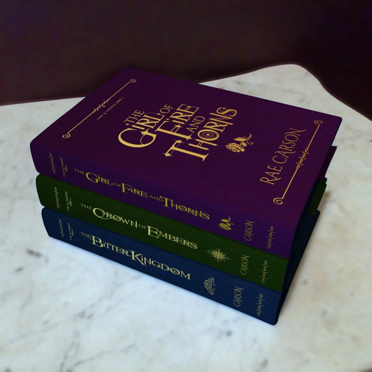
ANYWAY. On to my super awesome covers for the Fire and Thorns trilogy by Rae Carson (bonus points to anyone who can think of an even more super awesome title for these posts because I suck at titling things).
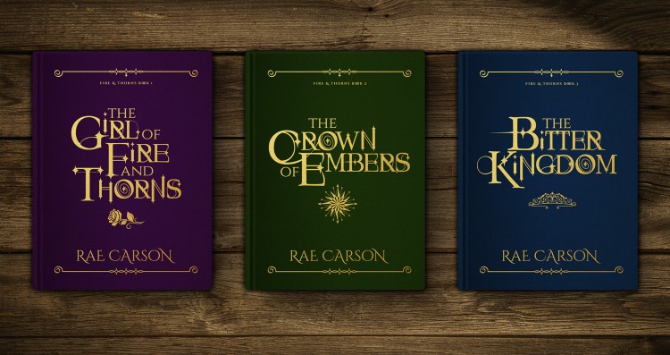
I went with a typography-focused design because I am a gigantic fucking type nerd (like, obscure facts and terms, fixating on the miniscule differences between seemingly identical sans serif fonts, there’s an hour and a half documentary on Helvetica on Netflix and it’s fascinating and you should totally watch it level of nerd). I found a fantastical, serif-based typeface and then spent an unreasonable amount of time customizing the letters because nothing makes me happier than customizing typography (I’d forgo cake, if this surprises you, see above parenthetical about how much of a type nerd I am).
I’m also super into iconography so I chose an icon for each book that represents a literal element/plot point in the trilogy and also symbolizes Elisa’s arc (Elisa is the main character for those of you who haven’t read this series and also what are you doing here? Go check these books out, they’re amazing). One of the cool things about designing your own covers for shits and giggles, is that I’m not working on any kind of timeline and can choose books and series that I’ve read in entirety. I know what themes and symbols will be important and can design with them in mind. This is kind of tricky when designers are coming up with cover concepts when the rest of a series hasn’t been written yet.
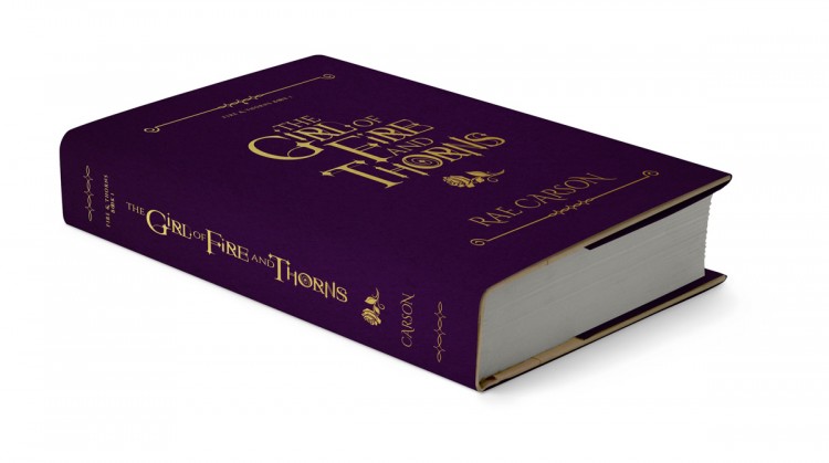
For Girl of Fire and Thorns I went with a rose icon. It both literally represents a major symbol of Elisa’s religion and also the beginning of Elisa’s arc. In the first book, she is very much a product of her religion, it was the major shaping force of her upbringing and she’s only just starting to question who she is outside of it. I went with a purple paper for the cover to represent the desert sky at night, the desert being a major part of book one’s setting (yes I could’ve gone with a sand-dune sort of color but it would’ve fucked up this whole cool palette thing I’ve got going on).
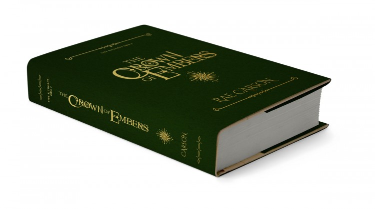
In The Crown of Embers, Elisa goes on a literal and metaphorical journey. I don’t want to get too spoilery but book two is all about Elisa finding answers to questions raised in the first book, hence, a compass. I went with green for this book because a tropical jungle-y environment plays a big role.
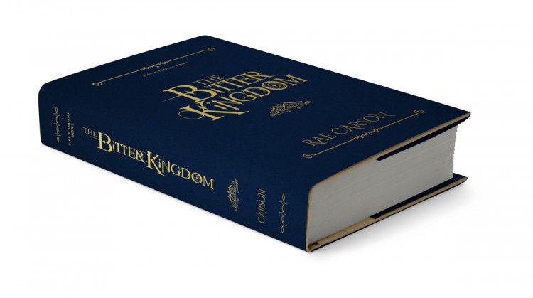
The Bitter Kingdom is all about Elisa being a badass queen who gets shit done, goes after what she wants and takes care of her people. A crown works on both a literal level (disclaimer, this isn’t actually how I envision the godstone crown but unless I was willing to draw it myself, my options were limited) and on a metaphorical level. In book three, Elisa is on top of her shit. She’s figured out who she is and what she wants, she’s come into her own, she’s a queen. I went with blue for the godstone and also to represent cold because you may have noticed that the color choices are tied into the setting.
Another cool thing about designing my own theoretical versions of book covers is that my budget is also theoretical and therefore infinite. For the Fire and Thorns trilogy, I envisioned gold foil stamping (exactly what it sounds like, you literally stamp press heated metallic foils into the surface) on a super textured, jewel-toned paper. Visually and tactilely an incredible idea, in terms of cost per book? Not super practical in a financial sense. But hahahaha, I can do whatever the hell I want. I’m basically working with the rosebud code from the original Sims (or was that Sims 2? I don’t know, I’m old).
So, yeah, there’s that (I am awesome at conclusions). I have a bunch of ideas floating around in my head and would really like to make this a semi-regular series. Hopefully I can build up enough of a portfolio and turn this into an actual thing I do in addition to a fun fan art outlet. What do you guys think?


Christina (A Reader of Fictions)
DO IT DO IT DO IT. MORE AWESOME COVERS YES PLEASE.
Meg Morley
YES MA’AM. ON IT.
Shannelle C.
MEGGGG OMG THAT FONTTTTTT WHAT IS ITTTTT AND WHERE DID YOU GET YOUR MOCKUPS ALL THE OMGGGGGG
I haven’t read any of these books yet, and if I did, I’d probably be just dead right now. It’s so BEAUTIFUL.
Meg Morley
THANK YOOOOUUUUUU!!!! I fond the font on dafont.com I think? (Maybe fontsquirrel?) It’s one of those free for personal use things and SO. SO. magical. The book cover mockups came from various places around the internet and for the last one, I took a photo of a stack of books wrapped in white paper dustjackets and just photoshopped the cover designs on (I tried to use a digital mockup stack but it kept coming out way to CGI)
(also you should 100% check this trilogy out because it’s amazing)
Fabi
Wow.
I am a sucker for pretty covers and I gotta say, the first thing I thought when I saw the three book’s picture was: “OMG, I need this in my bookshelf!”.
I haven’t actually read the books, but those covers, with the classic thing going on, are great! (told ya I’m a sucker for covers)
Really looking forward to seeing more of your cover reinventions. ^^
Which books are next?!
Meg Morley
Thank you!! Ngl, I am kind of trying to figure out a way to actually make them because I also super want them 😀
I’ve got a few ideas rolling around in my head, my process (when I’m working on my own timeline) is to let things sort of simmer on the back burner of my brain and then start working when a fully visualized concept is produced.
Sana // artsy musings of a bibliophile
SIMPLY STUNNING! Aaaahhhh
Meg Morley
THANK YOOOUUU
Kristin @ Simply Bookish Things
These are seriously some stunning designs for this series, I’ve never read this series before (but I really want to) and I can see lots of thought went into it. I almost prefer these to the original covers, I don’t know I love simplistic/minimalist look that’s going on in here! 😀
Awesome designs! XD
Meg Morley
Thank you!! I’m also a sucker for minimalism 😀 (Also, highly, HIGHLY recommend the series, it’s one of my fav fantasy trilogies)
Tara
Oh my! These are absolutely fantastic. You nailed it. I wish I had these on my shelf. Can’t wait to see more.
Meg Morley
Thank you!!
Sana // artsy musings of a bibliophile
Okay, I was obviously too taken aback by all the awesome that I didn’t actually read the post. But yes, yes, yes hundred thousand points for the kickass use of iconogaphy and the dark color palette goes amazingly well! I haven’t read the books yet (soon, very soon) but I totally get where you went with these.
Hell yeah to you designing more book covers! I’m especially looking forward to Lumatere covers redesigns now.
Meg Morley
Hahahahaha fun fact, I’m actually terrified to redesign Lumatere because HOW CAN I POSSIBLY DO IT JUSTICE? also because my brain loves to torment me and set impossibly high standards I now have an idea sooooooo
Sana // artsy musings of a bibliophile
I think you’re the only person I know who CAN do it justice. Seriously, not even kidding about this.
Yes, work on that idea, Meg!
Morgan @ Gone with the Words
Meg!!!! These are goooorgeous, you are so supremely talented! I love the rich jewel tones and the symbols, and your reasoning behind it all. But omg I love that font!! It’s stunning. And gold foil ahhhhh, it would be magnificent. Can’t wait to see what other books you redesign 😀
I REMEMBER ROSEBUD. It’s the only way I would play Sims hahaha.
Meg Morley
THANK YOU!! I had a lot of fun doing these.
(rosebud was my favorite of all cheatcodes, you could !;!;!; into eternity)
Brigid
Sooooo cool. I loved this series. As someone who has read it, I can absolutely say you have done a spectacular job Meg. I SECOND SANA: LUMATERE NEXT PLEEEASE.
Meg Morley
Thank you!! And I will (or won’t because perfectionism and fear) (but no I will) (maybe not next though)
Hannah @ The Irish Banana Review
Damn, girl! You got some serious skills there! I love this feature and really hope you do more! I can’t wait to have some of the covers you designed sitting on my shelves.
Meg Morley
Thank you!!! I really, really want to do so, I just hesitate to call it a series because that implies some sort of regular schedule and hahahahahahahaha I’m super awful at those. But YES. THERE WILL BE MORE. <333
Gillian
I. AM. OBSESSED. MEG. MEGGGGGGGGGGGGGGGGG.
Meg Morley
GILLIAN. GILLIAAAAAAAAAN. THANK YOOOOUUUUUUUU!!!!
ReadiculousGirl
Your post totally speaks to me…I want to become a cover designer because of my love of books (much like you), but I’ve had a hard time figuring out just how to accomplish that (my lack of technical computer skills and zero drawing/painting talent is slightly disconcerting considering my career choice). Your post completely inspired me today to keep going towards my dream job, so thank you for that!
I, too, am a font freak, and the one you picked for your covers is pure perfection. Keep on doing what your doing because those covers are DIVINE!
Crini
OMG, THESE LOOK AMAZING!!!! MORE!!! just not for series I love please or will cry forever that I can’t actually get them 😛
Haraiah
If this version ever comes out I’m totally gonna buy it even if I already own all of the Fire and Thorns books because it is amazing (both the trilogy and your design).
Bookphilia
I do cover designs for a small press and I’ve learned you don’t always get your way. The result isn’t always flattering to your skills too. When you inevitably become a cover designer yourself, have a pseudonym ready (is my advice) for covers that you don’t want associated with your actual name.
Lena Marsteller
Those are so pretty, Meg!!!!! I am a sucker for typography! Haha! I hope you continue to show us your beautiful works. I should really read this series soon…
wildpear
SO PRETTY, MEG! I love these. My little romantic old-fashioned heart wishes every book on my shelves could be this pretty. These give me the feeling of Belle walking into the Beast’s library (or Elliot walking into Luke’s 😉 . . . timeless and sumptuously lovely!
Carina Olsen
Oh my gosh, these are goooooorgeous Meg 😀 I WANT THEM. <3 You are oh so talented. Thank you for sharing about this sweetie 🙂 Such a stunning post. <3
Ginny
Ooo, these are beautiful. I also love that the compass symbol on book two is known as a compass rose, it ties in nicely.
Olivia
I LOVE this!! So beautiful and thoughtful. This is so fantastic!
Natalie
THESE ARE SO BEAUTIFUL! I LOVE THEM. MOST ARDENTLY (had to throw in a Darcy quote). Rest assured you have induced very real cover lust. Can’t wait to see more!
Cait @ Paper Fury
OMG THIS IS BEAUTIFUL. YOU ARE INCREDIBLE. I quite love these actually…like, seriously, sneak into the publishing house and accidentally leave these on the printer. *nods* Because that’s totally how it works.
Liza @ Reading with ABC
These are amazing and a vast improvement on the original covers, they didn’t do any justice to the awesomeness of the books.
Mae @ Such Magical Stories
I need these hardcovers in my life, pronto. Nothing against the other covers, but these are actually beautiful!
ValancyBlu
The covers are gorgeous – but you know what TOTALLY sold me???
The reference to the Helvetica Documentary —- I remember I had to watch it for graphic design class and I LOVED it so much I bought it. Best $14.34 ever. That interview with Erik Spiekermann? Like 10 shades of incredible.
🙂
Rekha @ Million Book Mill
Wow that is great! I was wondering, did you design the real book under the dust jacket only or did you also do the covers, because both are gorgeous! You’re great at designing!
Holly J
NOW I WANT THESE COVERS. I actually prefer them over the originals…
I still haven’t read this series. It’s funny, I DNFed the first book awhile ago and never picked it up again. That’s not that funny really, because I love fantasy and don’t know why that happened. I think it was my mood more than anything. So I definitely WILL be picking up this series again. I want to give it another try. And I want these beauties on my shelves.
I would love to see what else you come up with! Please make this a blog series or something. 🙂
Sarah J.
Wow! These are so amazing. I would definitely by these if I saw them browsing through a bookstore. You have a great eye for design!
Lyn Kaye
OMG is this just super awesome!! I believe publishers really underestimate texts on books and vivid colors. I love dresses and drawings and all of that, but those covers would make me buy a book if I saw it in a bookstore. Just sayin’.
Alex Hurst
OMG. Your typography is stupendous!!! I love the crisp quality, despite all of the detail. Major love from me…. and I need more of this… NOW!
Judith
OH MY GOD THE BEAUTY YOUR TALENT IS TOO MUCH FOR ME I CAN’T HANDLE IT
(on a serious note you already know how much i love these and you are insanely talented and this needs to become the official cover because i want these books on my shelf kthxbye)
(<3333333333333333)
E.Maree
These are *gorgeous*! If you go into cover design I would definitely hire you.
Annie
Those are so gorgeous!!! The colors – the iconography and oh my gosh the typography! I have an arc of The Girl of Fire and Thorns with the girl on it that they got rid of because she was too white-washed. I didn’t like her on the cover but I also never really loved the covers they came up with. I would totally buy the series with your covers – even if they were plain old hardback covers with the print dust jacket and not all gold imprinted.
Also, I would hire you in a second to design my books covers.
Angelica @ Paperback Princess
Meg you MUST send this to Rae Carson, it’s just too beautiful to go to waste, I’d definitely buy these books if it had this cover 😀
Weekly Recap| Jun 28 – Jul 4, 2015 | Oh, the Books!
[…] Meg designs her own covers for The Fire and Thorns trilogy. […]
Meg’s Super Awesome Cover Design Project: The Raven Cycle | Cuddlebuggery Book Blog
[…] name for! If you missed the first one/are wondering why the hell I’m doing this you can check out this post but the short answer is because I can and it’s […]
Lisa (Fic Talk)
All I can say is WOW.
Jessica Samuelsen
Are you open to being hired to do covers, I am looking for a graphics artist. I really like your style! It’s super professional… Please let me know!
Off the Page: Meg Morley - YA Interrobang
[…] Morley’s fanart isn’t the kind traditionally featured on Off the Page. She’s taking her graphic design background and applying it to redesigning beautiful covers for her favorite books. […]
Maia
Hi your cover is awesome, and at the moment I’m writing a book on wattpad, but I’m terrible at designing a cover!!!! I love the font you’ve used for the title!!!!! can you please tell me what it is!?