 Who Covered It Best?
Look, Dahlings, you want the best covers don’t you? And there’s nothing the intrepid cover fashion fanatic wants more than the latest on what’s hot and what’s not in the Young Adult Cover world. Well, so do we. Covers are important. A good cover can help sell a book and a bad cover can make it drag. We’re here to help, not hurt! But nobody ever got complete honesty without a little sting.
What works? What doesn’t? What makes us salivate for a new title? Read on to find out!
This week we’re looking at one stock image – Five ways, five covers and five critiques. See how different people have taken the same image to make their covers unique!
Image by African_fi.
[one_half]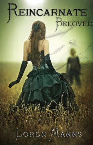 [/one_half]
[one_half_last]
Reincarnate, Beloved by Loren Manns
Oh Em Gee. Where do I start with this one? Drab is not fab but isn’t that type face just the cutest? I just want to get my hands on it and rearrange it a little. Tidy it up. Make it stand up and say, “Look at me! I’m <i>fab</i>ulous.” And what is going on with those whispy little smoke pieces? Frankly, they look like stink lines! Get rid of them! They don’t know if they’re coming or going or what they’re supposed to be doing. What they should have been doing was going, “Pop! Pop! Pop!” But they don’t pop. Also, I think one’s looking at me and it’s freaking me out a little. Make it go away!
[/one_half_last]
[one_half]
[/one_half]
[one_half_last]
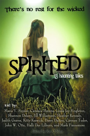
Spirited: 13 Haunting Tales Edited by Kat O’Shea
The saturation in this one has been jacked up and, you know what? I like it! I’m not sure what’s going on with the last name down the bottom. Why hide editor’s name? Why be all blurry and obscure unlike the others? Show off your colours! It really is much harder than the others though it would seem to be in a place of prominence. I’m confused, cover picture! What are you trying to tell me? I’m really feeling the font on this one – which I think pops. The tagline is great and I think this is probably the best variation of this cover in terms of over all style.
[/one_half_last]
[one_half_last]
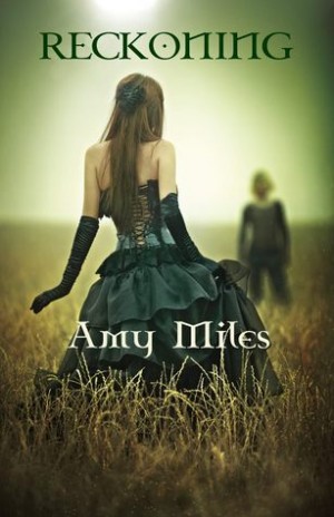
Reckoning by Amy Miles
I can’t say I’m fond of this one except to appreciate that the designer knew their limitations. Instead of trying to do effects that look ridiculous, they at least kept it simple. Whilst blessedly free of any confusing photoshop additions, the font, colouring and placement of the author name all seem like baffling choices for me.”Reckoning” doesn’t pop at all, and the author’s name is lost amongst the folds of the stock model’s dress despite the attempt to use a contrasting colour. The result leaves it looking amateurish and boring. At least even a horrible cover will stick out – this one does nothing. I want to take its hand and tell it to fly, soar, break out and be different!
[/one_half_last]
[one_half]
[/one_half]
[one_half_last]
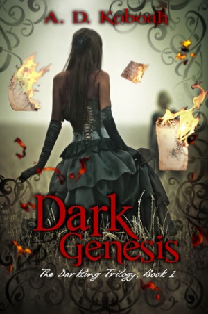
Dark Genesis by A. D. Koboah
There was an original idea behind this that I might have liked, but the end result is nothing but a mess. The problem with this cover is that there’s simply too much going on, and not nearly enough skill to pull it off. Both with photoshop and just aesthetically – it’s a mess! Douse it in water, call it a failed experiment and start again! The burning pages stick out and scream that there is an falsity of over confidence happening with the graphics department. There’s a lot of filler filigree used and it’s uneven and clumsy in its distribution. Even though, to be honest, I usually like filigree! But filigree is like a sword – you have to use it carefully or you’ll cut yourself. The whole cover screams novice. The conflicting fonts clash. I like the font used for Dark Genesis, but I think the colour’s completely wrong. Where as the second title is difficult to read and hard on the eyes. The author’s name is a blurred mess – what is it with blurry names today?!
[/one_half_last]
[one_half]
[/one_half]
[one_half_last]
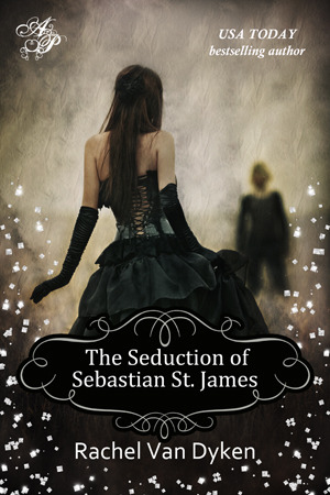
The Seduction of Sebastian James by Rachel Van Dyken
To be honest, whilst this cover isn’t as well crafted as cover #2, it is my personal favourite. The texturing of the background, the darker colours, the title framing and the bold, simple elements all won me over. But those falling flowers… oh. Here’s a tip, cover designers: Look at your cover then turn your head away. When you look bac, get rid of the first thing you see that isn’t the title. The flowers on this cover is like having a fantastic dress and ruining it with too much jewellry. The rest of the design is simple and elegant. It feels like they add an unnecessary flourish that the cover would have been better off without. But as far as style goes, I think this one has it in spades – But that’s just me!
[/one_half_last]
What’s your opinion? What’s your favourite cover? Comment and let us know!


Kenya Wright
This is by far my favorite post EVER! I love browsing covers. I’ve seen these books but had never made the simple connection that they were all using the same stock image. @aliciawbrewster @firebaptizedd
KatKennedy
@Kenya Wright I think I found the first three by myself and then saw the other two on a list.
Alex
They all kind of look like those covers in Wattpad 😛
I don’t think I like any but I loved this post 😀
KatKennedy
@Alex Haha! Same! But thanks!
Sugar & Snark
Great post! Mmm I think if I had to choose I think my fav would be The Seduction of Sebastian James.
KatKennedy
@Sugar & Snark Yeah that was my favourite too.
judy10001
The last one definitely strikes me as being the best, mainly because of how much more polished it looks 😀
KatKennedy
@judy10001 It does kind of appear that way – doesn’t it.
Iffath
Not gonna lie, I hate them all. Lol. But I LOVE the idea of cover fashion!
KatKennedy
@Iffath Yeah, they weren’t my thing either. Don’t get WHY this stock got used so much.
Krystal Henderson
I liked the last two, but especially the last one, because the others just didn’t seem to do anything different with the image.
KatKennedy
@Krystal Henderson Yes, they were rather unoriginal – I agree.
Cyn123
I’m so confused. Where are the covers?
Cyn123
Oh wait, I found them. The mobile version of your website doesn’t show them. I like the last one the most. Love the background!
KatKennedy
@Cyn123 Oh sorry! We will have to address this problem!
Cyn123
I’m so confused. Where are the covers? I cant find them.
Lissa Bilyk
LOVE this new segment. Looking forward to move cover fashion!
KatKennedy
@Lissa Bilyk Will do!
Kate C.
Speaking of covers… where’s my turtle with Jazzhands??
KatKennedy
@Kate C. I guess I’ll have to knock something up!
Lizzys Dark Ficiton
The last one definitely stood out the most for me. I actually don’t mind the flower things. The rest of them look bleh.
KatKennedy
@Lizzys Dark Ficiton They do! I wasn’t a big fan of any of them.
Bia_Lins_JC
I prefer the last one – the colors are right, and I actually don’t mind the flower things. 😀 Also, loved this post!
KatKennedy
@Bia_Lins_JC Glad you did!
Liza
My favorite cover is number one, because of the stink lines. 😀 Two and three are just too plain to me. Something is quite off about the fourth cover, though it’s visually appealing. The last one is pretty, but the guy in the distance sort of reminds me of a serial killer scare crow with the gray shading. (Whereas, he just looked like a harmless, Wizard of Oz scarecrow in the other pics.)
KatKennedy
@Liza I agree! It looks freaky as hell.
Stephanie Parent
I like the last one best…I just like what they did with the title framing. And I agree with Lissa that this is a really fun feature that you should do more of!
KatKennedy
@Stephanie Parent I’m glad you liked it! We will be.
cynicalsapphire
Haha, I like the last one best too, even though I think number 1 and 2 are perhaps ‘better.’ Number 5 is PRETTY DAMNIT.
KatKennedy
@cynicalsapphire Exactly!
MyEclecticBooks
I agree…none are perfect but the last comes closest!
KatKennedy
@MyEclecticBooks I agree. I don’t LOVE any of them.
christinashoe
Well…there’s none of them are perfect…but I guess I like #1 the best? But LOLOL stink lines. Really a turn-off.
christinashoe
Well…none of them are perfectly perfect…but I guess #1’s my favorite? But LOLOL “stink lines”. Kind of a turn-off.