 When you show up to a party, you’ve got to make a lasting impression. Something that makes you stand out and completely blow away all your competition. Amirite? Show up in a potato sack and you’re pretty much asking for a rotten tomato party. Unless you’re Lady GaGa.
This year we’ve seen some not so great covers that have caused us to quiver with fear. And then there are the truly amazing and creative covers that make you say, “Hell yeah, I’d hang that in my living room.” So, who brought their A game in 2012? Today, we are revealing a few of our favorite covers of the year, along with the help of special guest, Christina from Reader of Fictions!
Stephanie Sinclair:
So we are here with the awesome Christina from Reader of Fictions. And if you haven’t checked out her Cover Snark feature on Thursday’s then you are missing out on some much-needed end of the work week laughs.
Kat Kennedy:
And groans.
Christina:
Awww, thanks, Steph! Here’s the money I promised you.
Kat Kennedy:
Is it in unmarked bills?
Stephanie Sinclair:
Shush, darling. You said you wanted a gumball machine.
Christina:
Oh, of course. I know how you guys roll.
Kat Kennedy:
You know that was a condition right?
Christina:
All in unmarked bills and books with pretty covers, I promise.
Stephanie Sinclair:
Speaking of pretty covers:
Kat Kennedy:
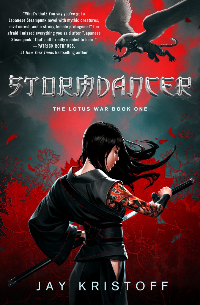
This was my favourite this year.
Christina:
BURUUUUUUUUU!!!!!
Stephanie Sinclair:
This was my favorite as well.
It’s perfect in every way, shape and form.
Christina:
I WILL SMITE ANYONE WHO DOESN’T LOVE THIS COVER.
Kat Kennedy:
I just love how different it is.
I honestly don’t know if there is any other you can compare it to
Christina:
I adore the colors. The grey and red set each other off perfectly.
Stephanie Sinclair:
They really did a great job capturing the essence of the book.
Kat Kennedy:
And of being unique. This one really stood out.
Christina:
I also loved that they captured a Japanese feel, but also very much set it apart.
Stephanie Sinclair:
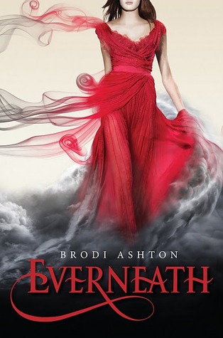
Another favorite, which is odd considering I usually hate the whole “look at me in my prom dress” covers. But wow:
Kat Kennedy:
Now THIS one was the best out of all the pretty dress covers.
Christina:
Yes. This is how to do a pretty dress cover.
I love how the smoke is slowly drawing her into the Everneath, perhaps like the Tunnels coming for her…
Stephanie Sinclair:
I would totally rock that dress.
Kat Kennedy:
Yes!
Christina:
I also love the swoopy business on the E.
Kat Kennedy:
Yes! The font is amazing
Stephanie Sinclair:
Yup, excellent job here.
Kat Kennedy:
Once again – brilliant.
Stephanie Sinclair:
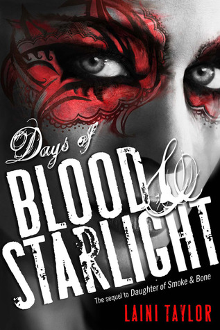
I love the mask theme this series has going for it.
Christina:
I love the eyes.
Stephanie Sinclair:
Very difference and original.
Christina:
Look how nice eyes can be without being made radioactive!
Stephanie Sinclair:
Exactly!
Kat Kennedy:
I think the contrast of the red to the grey tones really makes it special.
Christina:
Yes. What Kat said.
Kat Kennedy:
And the red is really vivid.
Just look at the subtle changes around the eye.
Christina:
Yes, I love the way that looks.
Kat Kennedy:
It has so much texture
Christina:
The font also suits the title perfectly.
Stephanie Sinclair:
Then there is Mystic City.
I love the shadows.
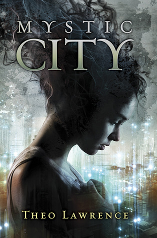
Christina:
Guys, in person, this book is SO SHINY.
Kat Kennedy:
It’s a nice style.
Christina:
Her hair is crazy, but I love it. There’s not enough curly hair on covers.
Kat Kennedy:
Very dramatic.
Stephanie Sinclair:
It’s a nice smoke effect. Makes it looks mysterious.
Kat Kennedy:
It looks like they’ve used a pretty simple effect and it’s been pulled off well.
Stephanie Sinclair:
Actually, that’s how I do my hair too.
Whenever I’m feel particularly badass.
Christina:
And you always look fantastic!
Maybe I need to start doing that with mine.
Stephanie Sinclair:
Thank you!
Kat Kennedy:
I love the grunge brush they’ve used up the top
Stephanie Sinclair:
Look at Kat. All technical.
Christina:
I know. I’m over here pretending I know what half the stuff she says means.
Kat Kennedy:
I have no idea what half the stuff I say means.
I make it up as I go
Stephanie Sinclair:
It’s the liquor.
Kat Kennedy:
The key is to say it with confidence.
Christina:
As long as you say it with confidence.
Stephanie Sinclair:
Haha!
Kat Kennedy:
Oh dear Steph! Looks like Christina and I are starting to meld together!
You might lose me to her
Stephanie Sinclair:
NEVER!
Christina:
MWAHAHAHA!
I will love you both equally.
Stephanie Sinclair:
Born Wicked:
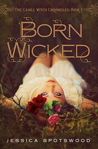
Kat Kennedy:
This is an interesting one.
Christina:
As much as I love this cover.
WHY DID THEY REDESIGN?
Totally not bitter.
Kat Kennedy:
LOL
Well, I think they’ve done a pretty good job.
Stephanie Sinclair:
I didn’t know it was redesigned!
Kat Kennedy:
The flowers on her head are stunning.
Christina:
I love the wanton way she’s lying on the ground. It dovetails perfectly with the title.
Kat Kennedy:
Yes.
And the title really is some stunning font work.
Stephanie Sinclair:
The look on her face is the same look I give Kat on Friday’s.
Christina:
Here’s the redesign:
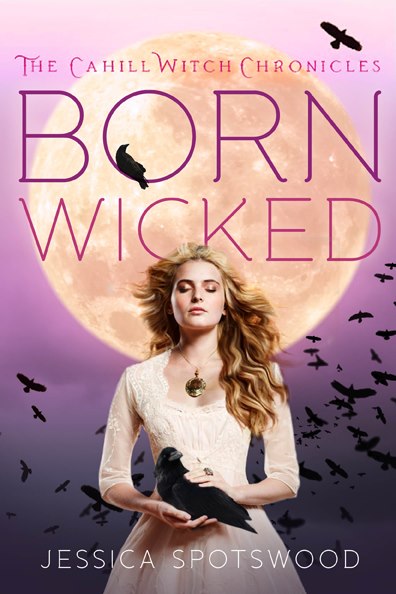
Kat Kennedy:
Nooooo – I totally like the redesign better.
That’s terrible.
Christina:
The redesign looks like an ABC Family made for TV movie.
But the original is gorgeous. I also think the nature plays well into the title.
Stephanie Sinclair:
Noooo… the redesign is awful compared to the original.
Kat Kennedy:
Wait, which is the original?
Stephanie Sinclair:
The first one.
Christina:
The one with the stunning font work that is not pink.
Kat Kennedy:
Okay, then I totally like the Original.
The pink font-work? No. no. no.
Stephanie Sinclair:
Exactly.
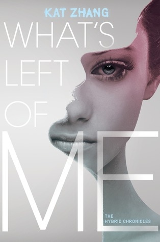
Christina:
This one’s just so cool.
Kat Kennedy:
It is cool.
Nice concept.
Christina:
I love the bright blue for Kat Zhang’s name.
Stephanie Sinclair:
The way they have two faces on the cover is a nice touch.
Christina:
Fits the book so well.
Stephanie Sinclair:
It does!
Christina:
I also really appreciate covers with a focus on font, when it’s done well.
Stephanie Sinclair:
I love it when you can tell the designer was given some type of direction.
Christina:
I love it when you can tell the designer did a lot of work.
Stephanie Sinclair:
Yeah, that too.
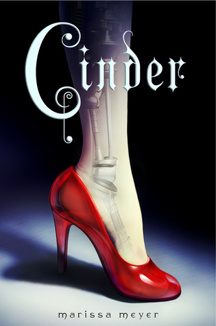
Stephanie Sinclair:
Simple and sharp.
Kat Kennedy:
Yes. Love that shoe.
Christina:
This cover vaguely creeps me out, but in a good way.
Stephanie Sinclair:
Yup, me too. It’s the cyborg leg.
Christina:
Yes, it’s perfect for fairy tales.
And they kept the style so well for Scarlet.
Kat Kennedy:
The font feels out of place. But otherwise romantic.
Christina:
I like the font, but I’m not sold on the positioning over the leg.
Kat Kennedy:
Or the way it fades.
Christina:
Why does the leg fade?
That’s a good question.
Kat Kennedy:
It felt it should be discreet?
Stephanie Sinclair:
I think it’s suppose to signify how Cinder hides it from everyone.
Or is that too deep?
Kat Kennedy:
Too deep.
Christina:
Wasn’t that what the robotics UNDER skin were suggesting?
Stephanie Sinclair:
Yeah, I think so.
Kat Kennedy:
What else have we got?
Stephanie Sinclair:
This one looks cute.
Christina:
Yay! I love this one so much!
Kat Kennedy:
Meh.
It’s okay.
Cute.
Christina:
I like how it doesn’t really look like anything else that I’ve seen.
The colors really pop.
Stephanie Sinclair:
This is true.
Looks like cut out pieces.
Christina:
The handwriting for the font really fits the book too.
Kat Kennedy:
The colours do pop.
I don’t think it’s bad at all.
Christina:
I think this really sells what the book is: fun and romantic.
I also appreciate the sort of classic look to the figures.
Kat Kennedy:
Well the colour scheme is really retro.
So is the way they’ve over exposed the people.
Stephanie Sinclair:
Does this creep you out or creep you out?
😀
Kat Kennedy:
I love it.
Just. Love. It.
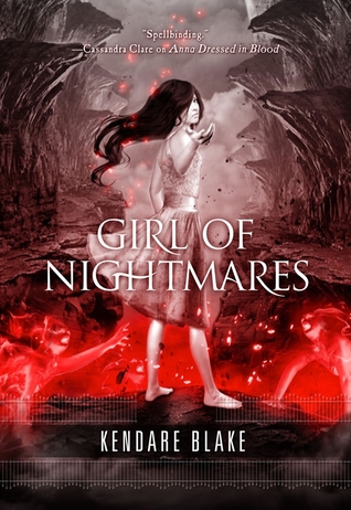
Christina:
I like how she’s going “Come at me bro.”
Kat Kennedy:
Really? She looks really whimsical.
Like a good bad dream.
Like you want to go with her, but she won’t take you anywhere good.
Stephanie Sinclair:
“Come with me to hell, if you please…”
Christina:
And the lava creatures coming for her! AHHHHH!
Stephanie Sinclair:
YES!
Christina:
I literally just noticed them.
Kat Kennedy:
Gah, you know, I never noticed them before.
Christina:
It looks like she’s about to go after the one ring or something.
Kat Kennedy:
Amazing cover for an amazing character.
Christina:
I still haven’t read these…
Guess I should do that.
Kat Kennedy:
DO ITTTTT!
Stephanie Sinclair:
OMG. WHY ARE YOU WAITING?
Christina:
TBR PILE!!!
Stephanie Sinclair:
Okay, so true story: I bought this book for the cover alone.
Christina:
Ooh, yes, these covers are so ridiculous and cool.
Stephanie Sinclair:
It looks AMAZING in person.
Christina:
I don’t know what’s happening, but I love it.
And, yes, it DOES look amazing in person. The spine’s gorgeous.
Stephanie Sinclair:
It’s so different from what’s out there
Christina:
I actually really approve of all of the fonts.
Kat Kennedy:
I really love the construction of this.
Christina:
I’ll be curious to see if the covers make sense with the story.
Stephanie Sinclair:
Creativity really was at work.
I just want to scream at all the Worst Dressed covers, “LEARN FROM THIS!”
Kat Kennedy:
Well, there’s obviously a huge disparity between ability.
Christina:
When I was bored in class, I used to connect the dots like that in my notebook. True story.
Kat Kennedy:
I don’t believe you.
LOL.
Christina:
You’re a jerk, Kat.
Kat Kennedy:
Yes, yes I am.
Stephanie Sinclair:
Well, seeing these covers restore my faith in humanity. Let’s hope 2013 continues the trend.
Christina:
From what I’ve seen so far, they seem to be.
Looking for our picks for worst dressed covers of 2012? Mosey on over to Reader of Fictions to check them out!
Steph Sinclair
Latest posts by Steph Sinclair (see all)
- Review: Jane Eyre by Charlotte Brontë - January 4, 2017
- Apollycon Blog Tour: Beth Revis! - October 21, 2016
- Cover Reveal: The Hearts We Sold by Emily Lloyd-Jones + Giveaway - September 21, 2016
- Apollycon 2017 Update: Where Da Party At? - June 3, 2016


rabbitsfortea
Seems like red and black is the way to go 😛
I adore all of the black and red covers and What’s Left of Me!
lilypondreads
Oo cover goodness. I have to admit I love covers <3 Mystic City and Everneath look beautiful
Lenore Appelhans
Forsaken is my top cover of the year. Lizzy Bromley is a genius! Also LOVE LOVE LOVE the red EVERNEATH dress. I want it bad.
Markella
So funny. I bought Forshaken because of the cover too. I havent even read it yet but it looks to pretty on my shelf 🙂 Guess that cover worked.
geobobspinelli
BURUUUUUU. Yes. Stormdancer was my #1 cover too! With Days of Blood & Starlight, Everneath, and Cinder close behind. Although, all of these covers are lovely, even if they didn’t make it to my list!
jarndt08
I freaking love the cover for Everneath and Blood & Starlight. I think I might have a thing for red? haha great post ladies!
Ashleigh Paige
I honestly hate the original cover of Born Wicked (and the redesign too, for that matter). There’s something about her pose that is just WRONG. I can only stand to look at my best friend’s copy of it if it’s upside down. Then she looks right. I’ve always wondered if the original photograph had her looking up and the publisher switched it.
Stormdancer, Everneath, What’s Left of Me, and The Forsaken are my favorite covers out of this bunch. Too bad that last one was a sucky book. Oh well, pretty cover. Looking at Everneath makes me wish I had my copy to cuddle, but it’s not with me. 🙁
Leanne Yang
I love all the covers here but I’ve only read Cinder! I get that we shouldn’t judge a book by it’s cover, but sometimes I can’t help it!
Nemo
Twitter: ya_atheart
Everneath is an amazing cover. I have a weakness for ‘pretty white girl in a prom dress’ covers, and this one is the best of the lot. What’s Left of Me was also an amazing cover, so lucky for a debut author to get one so amazing.
Kara_M
Twitter: NamasteRead
Stormdancer is probably my favorite cover of 2012. But I also really liked Unspoken by Sarah Rees Brennan. Kind of surprised to not see that one here. 🙂
Great post!
Deb E
I really like that “Mystic City” cover. But, really, a lot of great covers, here… and some really different styles. Goes to show that it takes some talent to pull off a good cover – it’s not just a matter of sitting down with Photoshop/GIMP and going 1,2,3 done!
The reds and greys do look great. I just hope we don’t suddenly get a whole bunch of them over the next year!
Man, it’s tough to stand out from the crowd.
Neyra
STORMDANCER!
(ooh i love how the font for this comment thingie looks all badass now >.< lol)
Anyways…. *coughs* I loved JKristoff’s cover and Girl of Nightmares, never noticed the lava people either though o.O And Mystic City is just awesome… mine copy doesn’t sparkle though 🙁 LUCKY!!
I love how all three of you girls interact, I don’t know how many times I shake my head whilst reading xD LOL
Neyra-
JeepinJaime
Crap on a cracker, people. I JUST NOW noticed the lava people on the Girl of Nightmares cover. Just now. Thanks for that favorite people!
katlb82
I love the Girl of Nightmares cover – I nearly bought another copy just so I could have the pretty.
Great post ladies! And you even agreed on most points 😉
veela_valoom
Twitter: veela_valoom
To answer your question about Forsaken: The cover makes A LOT of sense with the story. Unfortunately I didn’t really like the story. But the story & the cover do match. The cover is probably my favorite of the year.
suzanneearley
Oh, why did I go look at the worst covers post. Those were awful!
Of the ones you’ve listed, Everneath is my favorite. Interestingly, I have not actually read any of the books you’ve listed!
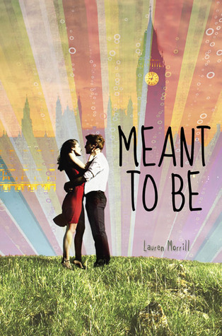
Heartless_Lyn
Twitter: heartless_lyn
Steph – thanks for admitting that you buy books based on cover alone. I don’t feel like a horrible person anymore.
What, what the hell, I’m evil. Nevermind.
That “Meant to Be” cover….eesh, Kat is right. It looks like someone got happy with Photoshop.
“Girl of Nightmares” and “Stormdancer” tie for best covers of the year.
Kate C.
Hilarious, as always. 🙂 Also, thanks for pointing me to a new obsession (Cover Snark -hilarious, Christina!!).
I think Stormdancer is probably one of my FAVE all time covers. For SO many reasons. Kick ass heroine, who is actually Japanese, as she is depicted in the book. That griffin is also amazing. And the title font is so freaking cool, too. I immediately bookmarked the artist for the future, assuming I could ever afford him. 😉
Also, I want that dress, from Everneath. Not sure where I would wear it, but it’s so pretty!
A few of my picks from this year that you didn’t mention:
http://www.goodreads.com/book/show/12109772-paper-valentine by Brenna Yovanoff
http://www.goodreads.com/book/show/11178225-out-of-the-easy by Ruta Sepetys
http://www.goodreads.com/book/show/10866624-unspoken by Sara Rees Brennan
The Hipster Owl's Bookshelf
What’s left of my has an amazing concept!! Took me a few seconds to get it entirely! Also, even though I didn’t care much for Cinder, I DID love the cover. Although the Spanish version of Cinder cover is actually more silvery looking and I loved it much more! 🙂